Wednesday, May 31, 2006

Do you remember an exhibition in a car?

Mongolia by David Klasen


The curator of en route via another route commandeered a car of the Trans Siberian express train to Beijing. It left Moscow on September 12 2005, the day that England drew the fifth test to win back the ashes.

I would have loved to have been on that train:

• To have read out, live on Trans Siberian Radio, a Russian translation of Keith Arnatt’s ‘Is it possible for me to do nothing as my contribution to this exhibition?’

• To have released some balloons and watch them float into the big skies of the steppe bearing the slogan ‘all that is solid melts into air’

• To have sat in the dining car , seen the abandoned dinner on the table, and read Gabriel Kuri’s note in Russian explaining that the person who had purchased it had left in a hurry. To find out how many countries the train would have to pass through, and how many translations of the note would have to be made, before anyone took up the invitation to eat the dinner.

Well worth missing the cricket for!

Were you there? Did you enjoy it? Did anyone eat that dinner?

Friday, May 26, 2006

Nothing

In 1970 Keith Arnatt produced a work of art entitled

‘Is it Possible for Me to Do Nothing as My Contribution to this Exhibition?’


The work consisted of a written statement in which he explored several different ways of doing nothing as a contribution to an exhibition.

All the ways of doing nothing that he identified, actually involved doing something. Even if that something was as simple as:

  • putting forward the idea ' I have done nothing' as a contribution to the exhbition
  • requesting some space within the exhibition in which 'to do nothing'
  • making the statement 'I will do nothing' and sticking to it for the duration of the exhibition

Arnatt was using conceptual art (art using ideas and language) to show the limits of conceptual art.

Lawrence Weiner made a famous statement about conceptual art to say that:
An artist can come up with an intention for a work of art and then:
• Might make it themselves
• Might get someone else to make it
• Might decide not to make the intention into a physical reality at all
Either way in Weiner’s view you still have a work of art that can be distributed, received and owned.

Arnatt has come up with an intention for a work of art that can not be made by the artist or by anyone else, and the intention of which can not be communicated by the artist to anyone else.

(I haven't been able to find the text of Arnatt's work on the web, but it is reprinted in full in the book 'Six Years' by Lucy Lippard.)

Wednesday, May 24, 2006

Things on walls

Photo by ebmorse of 'The Wall that Went for a Walk' at Stormking USA

Andy Goldsworthy builds walls that have renounced their mission, forgotten the boundary line that they were supposed to demarcate, and gone for a walk. They wind their way around and between trees, up and down hills, and into and out of ponds.

Last year part of ‘The Wall that Went for a Walk’ at Grizedale Forest in the Lake District got blown down by the wind.

This month ‘s Art Monthly reports that Goldsworthy declined the Forestry Commission’s offer to repair the wall. Goldsworthy said that:

‘I knew that change would continue after the making of The Wall and that I could not dictate or determine what that change would be’

The writer and physisist David Bohm identified the tendency of us human beings to defend our thoughts and opinions, to take up fixed positions. Bohm wrote:

we often find that we cannot easily give up the tendency to hold rigidly to patterns of thought built up over a long time. This kind of thought leaves no room at all intellectually for any other possibility


Goldsworthy has resisted the temptation to attempt to defend his wall, and recognised that no fixed state is sustainable over time.

Even if the Forestry Commission fixed it this time, for how long would they keep repairing it: 30 years, 100 years?

The act of repairing the wall would have seen the wall take back its mission as a wall again, holding back nature and holding back time. The wall that went for a walk doesn’t hold back anything.

Friday, May 19, 2006

Post-global art


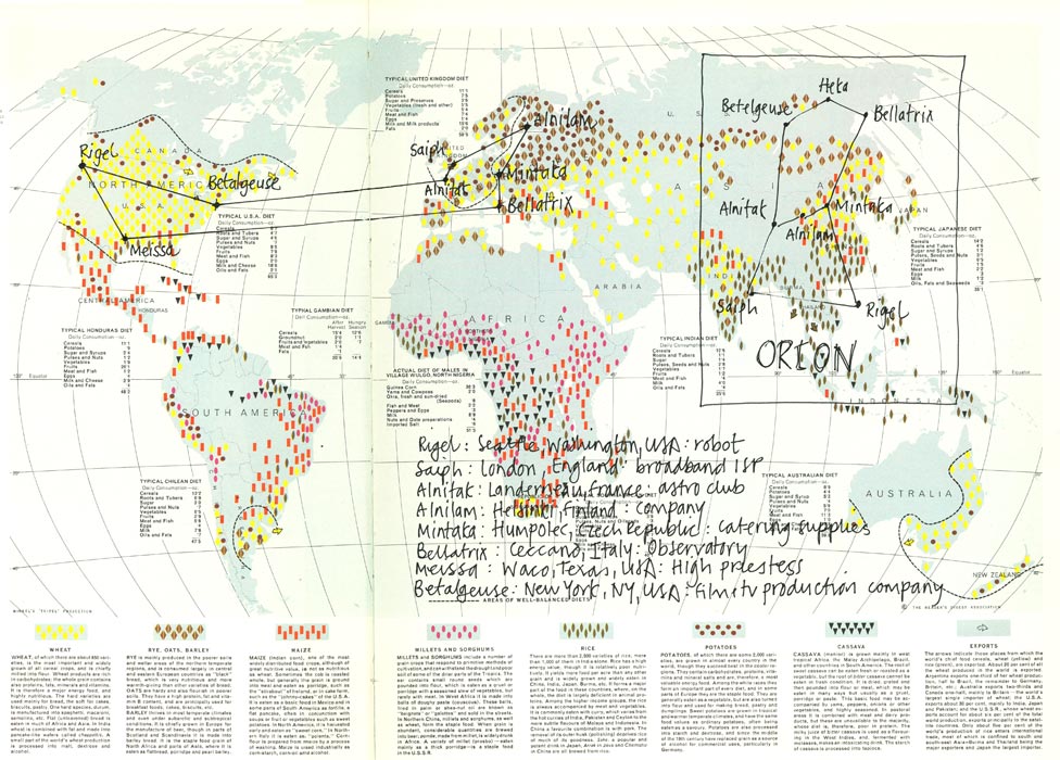
Jem Finer has meshed together the three spheres of the world wide web, the night sky and the earth.

He has found a website for every star : a website that names someone, somewhere or something on earth that shares or contains the name of the star.

You can find the links to these websites in 'On earth as it is in heaven', which provides access via his old readers digest atlas to a set of world maps: one global double page spread per constellation.

Each star in the consellation is plotted onto the atlas at the point of the earth where the person/thing/place that shares its name is located. Click on the star and the link takes you to the website that identified it. All the stars joined up by lines which make a new earthly shape for the constellation.

The picture above is the map for the constellation Orion . I was hoping that Jem would have found something about Betalgeuse in Guildford (where Arthur Dent thought that Ford Prefect came from). But instead the point is situated in New York, home of the Betalgeuse film and TV production company.

Stars, earthly towns and cities, websites, : lasting for billions of years, hundreds of years, years. When we come to map them we only have our human recognition of shape, our shared myths, and our understanding of words with which to map them with.

We have nothing anywhere near as potent and user friendly as the constellations with which to navigate our way around the world wide web.

Tuesday, May 16, 2006

Blank (700)

Making up a story for children is more fun than reading from a book.

Leaving some words blank for the kids to fill in is more fun than making up the whole story yourself.

Last night’s story went like this:

Two (blank) lived on the moon. Their house was on the edge of a (blank). In their bedroom was an enormous (blank) made out of (blank). In their living room was an enormous (blank) made out of (blank).

The blanks filled in by Andrew and Anna were:
1 children, 2 crater, 3 blanket, 4 lettuce, 5 sofa, 6 cucumber.

The last delivery rocket to the moon had been filled half with lettuce and half with cucumber.

There was no cucumber left after making the sofa so the family have been eating lettuce salad for the past seven weeks .

They have all been tempted to pick at the sofa to get some cucumber to liven up the lettuce salad. But so far they have managed to restrain themselves.

They next delivery rocket is scheduled to reach the moon at bedtime tonight. It is going to bring them (blank) and (blank).

Monday, May 15, 2006

The impossibility of choosing (433)

One week last summer I ran training courses in Glasgow and Manchester.

On the Tuesday night I was sitting out in George’s square, enjoying the Glasgow jazz festival, and wondering why I hadn’t followed the Scot in me and gone to University there when I was 18.

On the Wednesday night I was walking into Manchester’s Cornerhouse centre wondering why I hadn’t stayed followed the Smiths fan in me and gone to University there when I was 18.

It struck me that the two regrets were contradictory.

Some versions of quantum theory hold that for every choice you have made, the alternative paths that you didn’t take are followed by another you in a parallel universe.

Other theories state that if our universe is infinite in scope and duration then somewhere else in our universe, on a planet just like ours, another person just like you has taken/is taking/will take all the different paths that you chose not to take.

The ‘mis-guide to anywhere’ gives the following advice:

‘’in a place that is new to you, dream that you live there. Go on a quest to find this other self. Find the place you live; the place you work; the routes you take to see your family; the places where your friends hang out; your favourite places to eat or read or daydream; the places of crisis in this other life; the points of meeting and departure; the places of grief; the places of joy; the place where you can get the best plain pillowcase; the places where you can pick fruit from the trees; the place where you can get funny cards with the message spelled wrong; the places where your children might be born and the place where you might die. Live this other life for a day’’

Wednesday, May 10, 2006

Nostalgia (253)

Donskibeat has uploaded onto You Tube a film called Morrissey - Charlie's bus.

It shows Morrissey and Jonny Marr in 1984, taking a group of young school kids on an open topped bus to a sunny Kew Gardens, where they meet Sandie Shaw. They find a nice place to sit and listen to Sandie sing 'Jeanne' while Jonny played guitar.

I love the contrast between the sun shining on an idyllic setting, and all the kids enjoying themselves, having an ice cream, and Sandie Shaw singing the saddest of all the Smiths songs
'Jeanne, I don't know what happiness means, but I've looked in your eyes, and its not there'
set in the bleakest description of late 70s Manchester
'Jeanne, there is ice in the sink where we bathe, how can you call this a home,when you know its a grave?'

Tuesday, May 09, 2006

Conference (293)

I was in Manchester the other week, for the Records Management Society’s Conference.
In a break in the proceedings I visited the Cube (Centre for the Understanding of the Built Environment), to see their exhibition Found shared: the Magazine Photowork.

There is a good review of the exhibition by Redeye

Editors of Magazine photoworks collect already existing images and collage them together to make a magazine.

They look, feel and smell like convential magazines, but the experience of reading them is different. They do not attempt to inform or entertain you. They do not pretent to be ‘current’. The images inside them have a history, a previous life of their own. But you aren’t told what that previous life is. They are just presented as though those pictures were always meant to be grouped together.

The character of the magazine photoworks depends in part on where the editors get the pictures from:

Ohio finds its pictures in photographic archives, archives of different small societies or organisations. It takes these dull photos that would never see normally see the light of day, from totally unconnected archives, and presents them for you to read into them what you will.

Found is made up of bits of paper, notes and photographs that people have found in the street, or on trains, buses etc, and sent into Found. The Found website has things posted every day that people have sent in, but visually the magazine is more of a treat because of the effort that has gone in to fit all these things together on the pages to look like a magazine.

Permanent food takes their images from glossy magazines, and makes a new magazine out of them all that looks just as glossy, sensational and edgy as the type of magazines the pictures come from.

My favourite thing in the exhibition was a film called Helicopters made by Ohio. The film consisted of a succession of still pictures which happened to contain a helicopter, set to a musical background. In most of the pictures the helicopter was an incidental detail and in some it was just a smudge.

I chose to buy the latest issue of Permanent Food, mainly because on the contents page the section that started on page 73 was entitled ‘Back to the Old House’ (title of an old Smiths song). I have no idea whether the contents page was written by Permanent Food as some sort of commentary on the pictures they have brought together, or whether it was copied from another magazine and collaged into Permanent Food like all the rest of the pages.

Sunday, May 07, 2006

Other peoples titles (28)

Its funny how the kids come up with their most philosophical questions when we are in the car.

Yesterday we were just turning out of our road when andrew (age 6) asked
'have you ever tasted anything in a dream?'

On the Isle of Wight we were driving to to Brading Roman Villa when Anna (aged 3) asked:

'Where people made when the Romans were here?'

She had been to the Dinosaur museum the previous day and I think she was just arranging geological and historical time in her head.

I would love to use these as blogpost titles. What if I made a seperate list of potential blogpost titles, that I haven't been able to use while I am busy trying to use up Bruggerman's potential exhibition titles?

Saturday, May 06, 2006

Unfinished projects and ways of presentation (312)

Wes White has retyped the first twelve chapters and seven verses of Genesis and re-arranged all the words into alphabetical order. The words of (320 times) God (54 times).

You can buy a copy of it in fanzine form for £2 from his website: www.ecartilage.co.uk

In his forward to the fanzine Wes tells us how he had planned to spend till 2010 rearranging the whole of the King James Bible into alphabetical order. The project was first delayed (because of laptop failure) and then abandoned (because Wes read of Simon Popper's alphabetical rendition of Ulysses in this years Becks Futures exhibition).

If the story in the forward is true then it is one of art’s great coincidences that Popper exhibited his edition while Wes was starting on his. But I’d like to believe that Wes has made up the story, and in so doing has taken Popper’s idea and done something new and original with it.

Friday, May 05, 2006

It is really nothing (465)

The first concert I ever went to was The Smiths at Brixton Academy on Friday March 1 1985,
Three days before my 16th birthday.

The first song they sang was 'William it was really nothing'

Not a bad debut eh?

In the song Morrissey tells a suburban male that ''it was really nothing....... it was your life''. And somehow that has always come over to me as a very liberating and reassuring statement.

Nice to have it confirmed by another Steven (Bruggeman).

Wednesday, May 03, 2006

List

Oulipo were/are a group of writers who would not write a novel or a poem without first imposing rules on themselves to constrain what they wrote.

There is no better Oulipo resource on the web than Derek Badman's list of novels written using Oulipo-like constraints.

Not the least pleasing of the novels listed was ‘Negativeland’ by Doug Nufer.
No sentence in Negativeland was expressed with a positive construction.

Nufer does not discount the possibility that the inspiration for this was the number of rejection letters he had received from publishers for his previous novels.

It was announced this week that Stefan Bruggeman’s ‘Show titles’ did not win the 2006 Becks Futures art prize.

Monday, May 01, 2006

Can't wait for tomorrow (287)


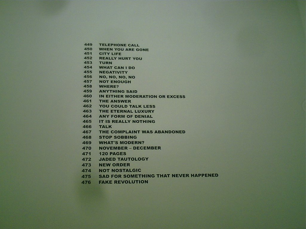
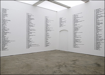
Stefan Brüggemann has painted 728 potential exhibition titles onto the walls of the ICA, in his entry for the 2006 Beck's Futures competition.

I believe that the winner of the competion will be announced today.

Bruggeman says anyone is free to use the exhibition titles if they want to. He offered first choice from the titles to the organisers of the Becks Futures exhibition themselves, and they chose a title for each of the three venues that the exhibition is being staged (London, Bristol and Glasgow).


The title for the London Becks Futures at ICA is ‘Can’t Wait for Tomorrow’, the 287th of Bruggeman’s titles.
  • I have decided to put all of these titles to good use: I am going to us them as the titles my next 728 blog posts.
  • I will not use any other titles until I have got through all of Bruggeman’s titles.
  • I will not use any title more than once.
  • I will use the titles in any order I like
  • I will make a blog post a day
  • I'm starting with this post: 727 to go now!

Saturday, April 29, 2006

Not a word

I haven’t been back (yet) to the ICA bookshop to buy one of Tino Sehgal’s words. Instead I went to the Whitechapel Art Gallery, for the first day of the Inner Worlds Outside exhibition of Outsider Art.

It shows the work of inspired and talented artists who weren’t part of the art world, and had never received any art training. People like Madge Gill who never sold any of her drawings in her lifetime because she didn't want to offend the guiding spirit who she said inspired them. Most of the drawings were found piled up in her bedroom when she died.

There is drawing from Gill that runs the length of one of the galleries, with the picture of the same woman appearing again and again in a swirl of shapes and colour. Apparently Gill would get a long roll of Calico and she would draw a bit, cover the drawing up and then unroll the next bit. until she had covered up the whole roll with her drawing. Must have taken months.

On the way out of the exhibition I was interviewed by the Independent on Sunday. The journalist took a photo. Might quote me in the paper this Sunday. I should have mentioned this blog, I might have got a free plug for it.

I went into the Gallery bookshop to buy an art mag. While I was there I bought, on impulse, a book by one French post-modernist philosopher (Deleuze) about another (Foucault). The reason I bought the book is that its opening sentence reads
‘a new archivist is appointed. But has anyone actually appointed him? Is he not acting rather on his own instructions?’

Its not often my proffession gets such a privileged mention in in philosophical texts. (I confess to not yet having read ‘Archive fever’ by Jacques Derrida).

So buy the time I had left I had spent £15. A tenner more and I could have had one of Sehgal’s words.

It is easy to spend money at the Whitechapel art gallery bookshop and the ICA bookshop. Sehgal is taunting me by selling his 100 words in the ICA bookshop. He is saying to me, ‘’you want to buy half the books and magazines in this shop. And yet you will end up spending £25, taking away nothing, for the sake of hearing one word’’

Maybe I should resist the Sehgal temptation, and use a line from a Smiths song instead to re-title this blog. That would be free.

Monday, April 24, 2006

Misguided

On 8 April 2006 Wrights and Sites published ‘A Mis-guide to anywhere’, a book of ideas for you to try out in your City: ways of walking in your City that help you to see it differently.

In the MisGuide they develop the old situationist idea of using a map of one city to navigate around another. (a bit like the I'm Sorry I haven't a Clue game where you sing the words of one song to the tune of another).

They quote the example of a Ferris wheel moved from Paris to Birmingham in 2003. The wheel still had the French audio commentary installed. For several weeks people looked out on England’s second city whilst being told to look out for familiar Parisian landmarks.

If you are in London, Wrights and Sites suggest you get a map of Paris and use it to find where in London the Eiffel tower is. Stop along the way to enjoy the Parisian ambience, find a place for a Ricard and a croissant.

Tania and I inadvertently did something like this on our holiday in the Isle of Wight. On the bookshelf of the cottage we were staying in there was a pile of leaflets about places on the Island. The pile included a guide to Mottisfont Abbey.

The guide described the history of the Abbey. and its conversion to a manor house after the Reformation. The house has a drawing room designed by Rex Whistler. A river runs through its extensive gardens, which houses the national collection of roses.

A check of its facilities (with our hungry son in mind) revealed the existence of a café/restaurant open every day and serving hot meals.

Sounded good so we got in the car and drove over to the West of the Island. Got there at 12. Kids bored and hungry after an hour in the car. Restaurant turned out to be a tea hut, which didn’t take debit cards. No disaster, back in the car to the nearest village for an agreeable pub lunch looking towards the cliffs at Freshwater.

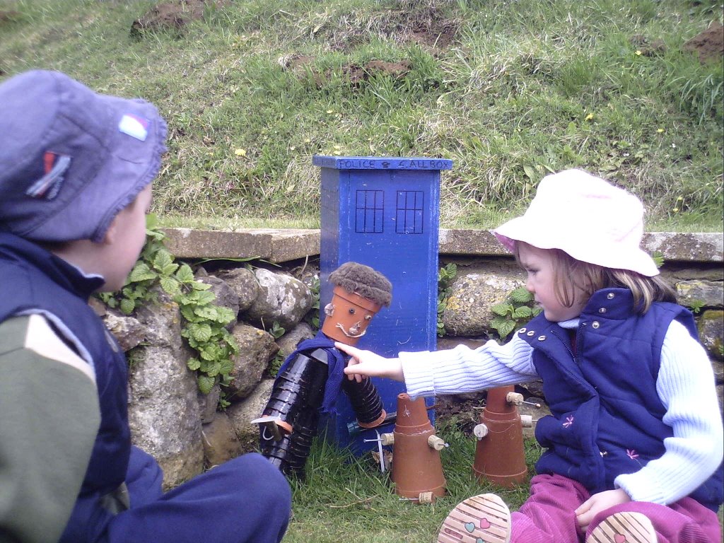
Should we go back? Might as well. After all, said Tania, it would be nice to see round the house. Back we go, spent an enjoyable hour helping Andrew and Anna find flowerpot men and women in the gardens.


(Here we found Dr Hoe and the Garleks)

Had a look at the house. It didn’t look much like an abbey, it didn’t look very open either. It wasn’t open.

A conversation with the Reception staff revealed that Mottisfont Abbey isn't on the Isle of Wight. We were at Mottistone Manor. The house in the gardens is a private residence which is open to the public one day per year (on the August bank holiday).

If I had known about the Mis-Guide we would have looked for the river and the rose collection.

Sunday, April 23, 2006

Update on Tino Sehgal’s words

I went back to the ICA on Friday.

I asked whether Tino Sehgal had read the text out yet that contains the 100 words he has been selling for £25.

The man in the ICA bookshop said that:

  • they hadn’t sold all 100 words yet
  • Sehgal will wait until they are all sold until he reads the text
  • There is no deadline set for selling the words. If they are not all sold Sehgal may never read the text

I am sorely tempted to go back again next week, buy a word, and rename this blog with whatever Sehgal word I get.

What do you think?

Friday, April 21, 2006

could you eat 24 cans of beans in half an hour?

Last night Mark McGowan and two fellow artists tried to break the world record for speed eating tins of baked beans: they were aiming to eat 24 tins in 30 minutes.

In the end Mark managed to eat 10 cans. Simon Ould won the competiton with 12 cans but was sick immediately afterwards.

There was an environmental angle to the event: Mark wants to raise awareness of the global gas crisis.

McGowan’s art mainly consist of protests. They are the type of protests that don’t hurt anyone. Sometimes they are about serious issues but the protests are never fully serious themselves.

To protest against unnecessary pollution from unnecessary car journeys he kept his Audi 80 running non stop in a car park in Peckham.

When one of his friends from Europe criticized the English breakfast he lay in a bath of baked beans, chips and sausages for a week as a gesture of solidarity with the meal.

To protest against wasted water he ran a tap non stop for days and days and hung a sign next to it saying ‘if you see this tap left off please switch it on’.

The running tap really got some people’s back’s up. The tap was in a gallery in South London. People rang in, wrote in and e-mailed in telling them to switch it off. Some people even came into the gallery and switched it off themselves. It was as though everyone in London was living in one big family: someone in the house had left a tap on and they needed to be shouted at until they turned it off.

Part of the ‘art’ in an event like that is the effect it has on people, the responses it provokes or evokes . I like art that attempts to impact on people’s lives in some ways. I know it wasted water in itself but I have definitely reduced the amount of time I spend running taps over the past two days since I read of his event.

Thank you to Russell Herron for his blogpost that alerted me to Mark McGowan: Russell described McGowan coming into the ICA bookshop and showing him a film he had made with Simon Ould.

In Russell’s words the film ''shows Simon, dressed in a black cape and crappy handmade crows beak jumping down the Duke of York Steps, then hopping around crowing while some kids point and laugh. The film ends with a rather long segment of Simon holding an umbrella made to look like a crow, again making loud squawking noises. ''

After eating 2 cans of beans in half an hour Simon really has got something to crow about now.

Saturday, April 15, 2006

Words

I’ve been reading The Phantom Tollbooth to Anna and Andrew. It was my favourite book from childhood. Milo and Tock visit the market place of Dictionopolis. The stall holders have buckets of words for you to buy. If you can’t afford a whole word (some of them are very expensive) you can go to the DIY stall which has buckets of letters which you can use to make your own words up.

‘Isn’t this market great!’ said Milo.
‘It is if you have something to say’ said Tock

Three artists have created installations in London art galleries this spring in which they present us with words: words that they have cut loose from the narrative structures (novels, books, a text) in which they had previously been combined.

  • Simon Popper has listed, in alphabetical order, all the words used by James Joyce in his novel ‘Ulysses’ (Beck’s futures 2006 , ICA, London SW1, until May 14 2006)
  • Simryn Gill has cut words out of books and sorted them into bags (Tate Modern, Level 2 Gallery, until 7 May 2006)
  • Tino Sehgal has been selling individual words at the ICA bookshop (as a spin off from his recent exhibition at the ICA)

Each of these artists has something to say, and is using words to say it. Visitors to these installations are faced with a challenge: how do we 'read' these words?


Popper’s A-Z list of the words from ‘Ulysses’

By reducing Joyce’s Ulysses to an A-Z word list, Simon Popper kills of the main character of the book, Leopold Bloom.

Bloom is no longer evoked as a living, breathing human being, walking the streets of the city of Dublin. He is no longer even named. There are many occurrences of ‘Bloom’ in the words beginning with B, and many of ‘Leopold’ in the words beginning with L, but no link is made between the two words.

We can no longer read the book. We can only look at the debris, the words strewn across the page like boulders on a beach. Like geologists we can only speculate on the creative force that could have brought this set of objects together.

Alongside the A-Z wordlist Popper exhibits a model train on a circular track. The train bears the livery of ‘Blum and Popper’, a company operating in Trieste where Joyce stayed when he wrote Ulysses. The name of the company had given Joyce the idea for the name of his main creation, Leopold Bloom. Now the same company name has given Popper the idea for a work of art that un-names and un-creates Leopold Bloom

The train shows the power of coincidence as a creative and destructive force: the coincidence of a connection between James Joyce, Leopold Bloom and Simon Popper.


Gill's bags of words

Simryn Gill’s installation 'Untitled' at the Tate Modern consists of:

  • A list of the books in the installation
  • A list of over 80 words that Gill has (literally) cut out from every book each time the word occurs
  • A set of archival quality boxes, each containing a bag of the cuttings of a particular word
  • A set of worktables and chairs at which you can sit down and open the boxes and look at the bags of words
  • A shelf of all the books. You can pick them up and browse through them. There are holes in them where the words have been cut out.

One of the words that Gill removed from the books was ‘small’ I thought it amusing that I could go and look at a bag of smalls.

The shelf contains the type of miscellaneous assortment of books you might find in a hospital waiting room. I was drawn to ‘The Bookshops of Sydney’ written in the 1970’s: a historical survey of the second hand and new bookshops of the city, with lots of black and white photographs. There are also some ‘Observer books’ that I remember loving when I was a kid.

The books are now impossible to read. When you come to a missing word you know that it might be one of the 80 or so words that Gill has raided from the books. But then again it might not. It might have been printed on the reverse side of the paper from one of the words on Gill’s list, and in that case, if you wanted to find the missing word you would have to:

  • work out which word was cut from the other side of the paper
  • go to the bag or bags for that word
  • sift through the bag until you found a piece that matched the shape of the hole
  • manoeuvre that word around inside the bag until you can read what was on the reverse side of it.

The loss of comprehensibility of these books by the actions of the artist is a key element of this work. Gill has highlighted the loss by allowing us to browse the books, to see what we are losing, to be tantalised by the information we can no longer glean.

In this installation the bags of words are more cared for than the mutilated books. They have been brought together purposefully, as though by a curator, in archival quality bags secured in archival quality boxes. The bags of words will be helped to resist the ravages of time longer than the books which brought them into existence.

Looking at a word in these bags is like looking at a roman coin in a museum. Like the coin, the word has a meaning. We can read a meaning for the word like we can read a value for the roman coin. But for both the word and the coin we can tell little or nothing of what the coin meant to the people that handled it, that wrote/read bought/sold/ with it. The words, like the museum coins, are out of circulation, reduced to being one instance of the many instances of that word/coin. The only thing that the words or the roman coins really tell us about is the collection policy of the individual/institution that brought them together.


Sehgal's £25 words

Tino Sehgal aims not to leave any traces of his work. For his latest exhibition at the ICA:

  • The publicity text didn’t tell you what the work was about or what it consisted of
  • The title of the exhibiton was simply ‘Tino Sehgal'. This was the second of three exhibitions of his at the ICA with that title.
  • There was nothing tangible in the exhibition to view, nothing on the floors, nothing on the walls.
  • The work itself consisted of the conversations that the exhibition guides have with you as you walk through the empty galleries

Tino hasn’t left any traces of his work, but the work has left traces in the world. B, Russell Heron, and Jasmine Chan are bloggers who have each attended the exhibition and described their experience of it.

As an adjunct to his ‘Tino Sehgal’ exhibition, Sehgal invited people to purchase, from the ICA bookshop, for £25, an original work of art of which the author has created a limited edition of 100. Sehgal did not leave any further trace of the work than that: no description of it, no viewing before you buy.

As luck would have it the guy in the ICA bookshop, is a blogger. his name is Russell Heron, and he has put up six interesting blog posts about people buying this work of art.

  • post 1: introduction: the work of art is a paragraph, 100 words long. You can come in and buy a word from the paragraph for £25. The word is whispered in your ear by the guy in the bookshop (our blogger). You don't get the word written down, or a receipt. Words are sold in the order they come in the paragraph. If you buy a word you are invited to come and listen to the artist read the whole paragraph
  • post 2 journalist from the Times buys a word
  • post 3 journalists from the Evening Standard and London Tonight buy a word each
  • post 4 The Evening Standard journalist tries to sell their word on e-bay for £4.99 to recoup some of the money they paid out for the word (and couldn't claim on expenses because ICA wouldn't give them a receipt)
  • post 5 Russell Heron bought the word on e-bay himself, for £5.51

Heron has not (at least not yet) posted anything about the completed paragraph: I'll do a technorati search of the blogsphere to see if anyone has written anything about it and report back to you in a later post.

Sehgal’s work works in the opposite direction to that of the other two artists. Popper and Gill took books which we know already and wrenched words out of them to force us to look at the words in a new way. Sehgal offered us the words whist delaying our access to the text which brought them together.

Seghal seems to be mocking us for our dependence on writers or artists to create meaning for us: we are so dependant on artists to create the meaning that we will even pay for words which are free (just like the shoppers at Dictionopolis). The spectators are disempowered, sepeartated and taken advantage of by the artist.

A thought on the three works

In each of these we encounter words which are objects free from the meanings that the author may have intended for them. W are invited to free ourselves from having to imagine what the author might have meant in using these words.

Instead we wonder what the artists meant by freeing us from imagining what the authors meant when using these words

Thursday, March 30, 2006

Jim Latter's 'Stations of the Cross'

‘Stations of the Cross’ by Jim Latter is a series of 15 paintings. Each painting relates to a particular point in the journey of Jesus from condemnation to resurrection. The paintings are on display in St Mary le Bow church for the duration of Lent (until Easter Sunday, April 16).

The paintings are incredibly simple. Each shows the same sized rectangle on the same sized piece of paper. Each rectangle contains a cross. The dimensions and proportions of the cross do not vary. This gives the series coherence, strength, and power.

Using only colour, shape, pattern and the relationship between the foreground of the cross and background of the rectangle, the artist manages to convey or suggest something of the essence of each of the episodes in the story of the Passion of Christ, and also something of the essence of the story as a whole.

I visited the exhibition four times. On my third visit I quickly toured round the 15 paintings, making a note into my laptop of what I perceived in each painting. Yesterday lunchtime I went back to note down the titles of each painting. By a nice co-incidence Jim Latter was in the church at the time. He introduced himself, and walked around the exhibition with me.

What follows is, for each painting, firstly the original notes that I took of my perceptions of the painting, and then some of what Jim told me of how he made the painting and what he was looking to convey.


I
red at the bottom fading in to black at the top. like a sunset or a dawn with light diffusing but it feels like the darkness from the top is pushing down on the red fading light below
(condemned)

Jim’s comments: I paid a lot of attention to the proportions of the cross, and the ratios between it and the rectangle that the cross is contained in. I’ve noticed that most of the crosses you see in churches haven’t got the right proportions. The dimensions of the cross in this rectangle create two squares as background above the arms of the cross, and two rectangles below the arms.

I started by placing masking around the rectangle and over the cross. I painted the background with layers of acrylic paint. Then I uncovered the cross, masked the rest of the rectangle and painted the cross.


II
the darkness is lightened somewhat. The cross is brought to the fore by evenly spaced vertical lines, like scars that cut across the grain and run down the cross - both its arms and its support. In the background you have green light at the bottom fading into grey at the top.
(taking up the cross)


III
the cross stands out blue, garish and the lines on the cross are at an oblique angle, all leaning the same way. The background is brown - a light mud brown – but it is scarred by lines, lines that have been made before the imposition of the cross, lines that are interrupted by the cross.
(first fall)

Jim: I masked over the cross and used a ruler and a knife to scour lines into the paper in the rectangle. I did it with a ruler, more or less at random. Then I scoured the diagonal lines onto the cross.

I used a blue oil pastel to colour the cross: it was like brass rubbing, it’s a solid lump of pastel and, the pastel doesn’t get into the channels created by the knife. The scourings into the paper are there to show the pain, I was thinking of someone scraping their fingernails down a blackboard.


IV
the only one where the pain spills outside of the rectangle and reaches into the white space beyond the rectangle. The one where the cross almost merges into the background, the cross is a deeper blue, the background the same blue more lightly applied, it is watercolour and you get the fluidity of the cross and the background joining, spreading, merging, like the baby and the mother in the womb.
(mary)

Jim: I wanted to show the pure pain and grief of a mother for a child. I thought of tears.
I used a different technique for this one. I didn’t use the masking tape. First I wet the whole rectangle and dripped drops of blue watercolour (like putting in eyedrops). Most of the blue stayed within the rectangle but sometimes the blue splashed outside the rectangle, like tears.

I waited till it dried then I wetted the cross, leaving the background of the rectangle dry. I dropped blue paint onto the cross to make the cross stand out from the background in a deeper blue, knowing that some of the blue of the cross would spill out into the background.

V
wow. Colours, bright colours. The cross marked out by vertical stripes going from left to right (arm) green black yellow red green black yellow (support) red green black yellow red (arm) green black yellow red green black yellow. The four corners of the background are reading from left to right and top to bottom: black green yellow red. The background corners have diagonal lines each diagonal taking the line from the edges in towards the centre of the cross, the cross of the cross.
(Simon)

Jim: I spoke to Rev Bush (the minister at St Mary le Bow) about Simon. He helped Jesus. Some sources suggest he was black. I wanted to use colours that paid homage to that: I wanted to use Rasta colours.


VI
watercolour again. The cross brown, the background a dull blue. Some horizontal drips of blue flow downwards and change their course as they flow over the brown cross. Several patches of the cross are a darker brown, where the head would be, where the feet would be, where the arms would hang
(Veronica)

Jim: Veronica wiped Jesus’ brow with her cloth, when she looked at the cloth afterwards the sweat had formed the image of Jesus’ face on the cloth.

I made the cross wet and applied the brown, then I made the background wet and applied the blue watercolour.

When you wet the paper it buckles, when it buckles the paint runs into hollows and groups in different places: you can’t control how it turns out. The dark patches of brown you see on the cross could have occurred in any pattern, it was beyond my control, I was amazed to see that way the dark patches have grouped suggests the presence of the body of Jesus, like an x-ray.

VII
cross is a blue, a deeper blue than before. Background is brown, a deeper brown than before. The lines on the cross are diagonals moving downwards from right to left. In the background there are lines, interrupted by the cross, entangled lines, lines that form an entangling meshy trap like lots of ropes that keep tripping you up
(second fall)

Jim: If the scar lines on the cross had been horizontal and vertical everything would have seemed stable: I made the scar lines diagonals to show the instability, the falling


VIII
watercolour. Cross is brown but invaded by the colours of the background which is a tie died, psychedelic, rainbow of beautiful, peaceful spectrum-like colours.
(women of Jerusalem)


IX
the cross is a duller blue, almost all the blue has faded now. The demarcation between the blue of the cross and the brown of the background is being lost: they are fading into one. The lines of the cross are diagonals going downwards from left as I view to the right. The same entangling, tripping lines.
(third fall)

X
the mood feels different over here, more serious, less human, less alive, hope has been stripped out. The cross, white, the background black with paler patches.
(stripped)

Jim: The cross is bare, just white, to show the nakedness of flesh. For the background I wanted to create the effect of metal. To show the vulnerability of the flesh against the harshness of the metal.

XI
the cross red the background red. The cross demarcated from the background only by the different orientation of the lines scarring its surface. The lines scarring the surface of the background run horizontally, the lines scarring the surface of the cross are orientated vertically. The lines don’t run as neat parallels: they are entangled lines, like the lines in the paintings of the falls
(crucifixion)

Jim: I’ve given this painting to the church, so it will stay here at St Mary le Bow when the exhibition has finished.

XII
black. Only black. If you look for a long time, the black of the cross appears to show out from the black of the background.
(death)

Jim: I painted the whole rectangle black. Then I masked over the background and gave another coat of the same paint to the cross. So the only difference between the background and the cross is that the cross is painted twice.

XIII
some colour is coming back. Pale colour, but pale hopeful colours. The foot of the cross is pink like flesh, the foot of the background is green like grass, pink and green fading upward but the colour of the background at the top is blue, not black.
(taken down)

Jim: for the blue at the top I was thinking of all those renaissance paintings which seem to have a clear morning sky, when it hasn’t got hot yet, when there is still a bit of freshness in the air.

When I painted the cross I had in my mind a picture from an American comic that was passed round my school when I was a kid. It was a pretty nasty comic and one picture showed a picture of a man who had been shot. The man was slumped back on a chair, his arms hanging over the sides of the chair. He had obviously been dead for some hours and the blood had sunk down to the bottom of the arms, so the artist showed the top of the arms as pale, getting pinker as you moved down towards the man’s hands. This was my image of what death was for a long time.

XIV
the cross is black with thin, horizontal, evenly spaced, parallel red scars. The background is black with thin vertical parallel scars.
(entombment)

Jim: There is nowhere that the horizontal lines of the cross can go, they are trapped by the vertical lines of the background. I wanted to give that feeling of being closed in, of being unable to move. This is also a nod to the work of Frank Stella, an abstract artist whom I admire.

XV
white. If you look for a while you will see the white cross emerging from the white background and appearing to light up the white of the paper outside the square.
(resurrection)

Jim: I didn’t know what to do for resurrection. I spent two weeks wondering around my studio without a clue on how to depict it. Then I thought ‘white’.

I painted the whole rectangle white, then masked out the background and painted the cross again with another coat of white. But the second coat was very light, there is very little difference in weight between the white of the cross and that of background.

When you look at this you are seeing four different whites: the white of the cross, the white of the background, the white of the paper, and the white of the mount.

Some comments from Jim about the work as a whole
When I researched the stations of the cross all the previous work I came across, with one exception, were figurative, depicting in some way the people involved in the story. The one exception was a Stations of the cross by the abstract artist Barnett Newman.

Newman's work simply used geometric shapes, it did not even use the cross. But somehow it worked. I saw it in London when it came over as an exhibition about 5 years ago. I felt that the work gave me 'permission' to do the work without figures. At one point I was thinking of using circles as the basis of the work, but after a time I realised that I needed to have the cross in there.

Some comments from me for Jim about the work as a whole
It seems that most stations of the cross by other artists have 14 stations: is your work unique in adding the 15th station, for the resurrection?
The first time I saw this work it was the contrast between the black of your depiction of death, and the white of your depiction of the resurrection that really sucked me into this whole work. The contrast gives a pure energy to the work, like a star near a black hole.

Does the series continue after resurrection? Does the slight difference between the white and the white mean a new cycle, a different cycle starts anew? Or does the white gradually dissolve into the white?
Wednesday, March 29, 2006